I know a lot of people manage projects in one way or another – even if you don’t do it for money, it’s the sort of thing that comes up a lot. Building a house, organising a camping holiday, writing a book proposal… they’re all projects, and they all go better if you manage them.
In my day job, project management is something I run into fairly often. Working on Close Encounters and its expansions is also a project, so when I started seriously developing it I knew I needed to get organised.
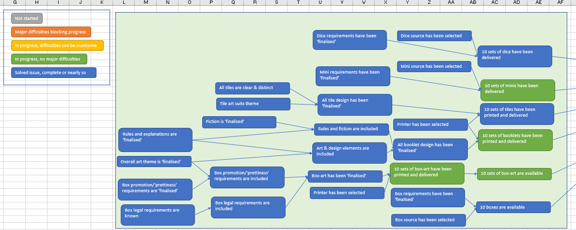
The first thing I did was make a list of everything that needed to be done before the project was finished. I didn’t worry about getting it all right at this point, because I knew I was going to be changing and adding things as I went. I put all the things in separate boxes in an Excel spreadsheet, so I could drag them around. Then I arranged them in reverse order – what had to be completed last? What had to be completed immediately before that? And so on and so on. I drew lines to indicate how they linked up.
As I went, I kept on discovering that I’d left things out or that things were worded wrongly. That’s fine – I just added or changed new boxes, changed the lines and moved on. Eventually I had my project network more or less right. Then I colour-coded the boxes to indicate their status. As an example, here’s how part of my project looked.
I find this sort of colour system makes it much easier to see where I need to focus my efforts. You wouldn’t manage a major project this way (there are better tools for that), but for something like this it helped me a lot.
For development work, where I don’t always have a clear idea of the obstacles before I get started, I use a different system. It’s described in more detail here, but it basically boils down to a traffic-light system – green, orange, and red.
Green means ‘easy’ – you have high confidence in being able to do something. You know what to do and that it will work, so you can be confident in your estimates about time and work required for it. It would be nice if everything was green, but if it was then you probably wouldn’t be trying to organise your project like this!
Orange indicates ‘analysis’ – you’re confident that the outcome can be achieved, and you have an idea of the possibilities you need to explore, but you need to do that exploration before you can come up with a plan. You’re likely to come across things you weren’t expecting or that don’t work how you thought they would. I spend a lot of time in this zone!
Red indicates ‘can of worms’ – you don’t have much idea about how to do whatever it is, and you need to do a lot of discovery work before you can even figure out what the options really are. It’s still worth indicating these areas, because it’s a good way to discover the boundaries of the possibility-space you’re operating in, but you can expect to discover things that will have big effects on what you’re trying to achieve.
Because I’m an amateur at game design, I have to spend a reasonable amount of time doing things marked in red. That’s okay, because I like finding out what other people have done, and how and why. I just have to remember not to get too sidetracked!
